Most Dreaded Terror 5 Denmark

https://www.google.com/search?hl=en&tbm=isch&source=hp&biw=1144&bih=550&ei=Rt02WuPBFIqpjwTiw46wCw&q=golden+eagle&oq=golden+e&gs_l=img.1.0.0l10.6800.18112.0.20870.8.6.0.2.2.0.77.434.6.6.0....0...1ac.1.64.img..0.8.436....0.JX5UDcWq7S0#imgrc=hPv420Jc5F3bIM: downloaded 12/17/17
It is 26 of Feb., 2018, and we are piling on the data. We are in pursuit of something that is inherited but not genetic and which is able to stabilize a population of animals so that it has a chance of not going extinct, but the same mechanism will kill babies, kill too many babies, if we are ignorant of how it works.
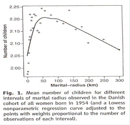
- The next data set comes from Denmark. Rodrigo Labouriau and António Amorim compared fertility in Denmark with something they call “marital radius” (how far apart a couple were born). This is what they found:
Comment on “An Association between Kinship and Fertility of Human Couples,” Rodrigo Labouriau and António Amorim, SCIENCE vol. 322 no. 5908 December 12, 2008 page 1634. For the whole story also see Human Fertility Increases with marital radius. Rodrigo Labouriau and António Amorim. GENETICS volume 178 January 2008 page 603.
- It looks a bit like the Sibly curve. At marital radius fifty kilometers or less we see the inbreeding depression we knew all along had to be there.
- At marital radius one hundred kilometers or greater there is a linear decrease in fertility as distance increases. Extrapolating a straight line is straight forward; eventually that line must reach zero. Is clear that if you heedlessly select mates from a great distance (marry very distant kin) for enough generations the population will die, while marrying closer kin would let the population continue to flourish. We already suspected as much from the Iceland data.
- There is a notch between fifty and one hundred kilometers. We will be seeing notches ad nauseum in data to be shown later. I am not clever enough to figure out whether this notch is the equivalent of all those others.
- The graph shows fertility compared with distance rather than area. To make it comparable with the Sibly curve as shown we would have to square the distances. This would pile numbers up on the left and stretch them out into the familiar curve on the right.
- As for choice, the team specifically compared education and income with fertility. They found that after you allow for kinship as measured by town size and marital radius there was no effect at all of these things on fertility. The only choice made is “at the altar” – choice of mate.
- As we shall see later, there is evidence that folic acid in standard clinical dosage can reduce fertility, too.
YouTube video script directory
Home page