IN SEARCH OF THE MECHANISM FOR INFERTILTY SECONDARY TO INSUFFICIENT KINSHIP AMONG MAMMALS
There is a very strong prejudice against marriage between cousins. As is often the case with prejudice this is based on ignorance. Concerns about inbreeding can be dealt with by appropriate genetic screening made possible by the field of medical genetics.
Typically prejudice harms both the victim and the guilty party. In this case the penalty is a loss of fertility that threatens the survival of the population.
Consider a valley with 1,000 animals, say mice. One mouse has a particular normal chromosome. 
It replicates, 
 and the two copies wind up in two offspring of the original mouse. One mouse scurries across the valley, and while it is there the climate undergoes an abrupt change. A glacier splits the valley in two. The glacier remains for two thousand mouse generations and then melts. The F2,000 mouse from the far side of the valley returns and mates with an F2,000 mouse from the near side. But they cannot have normal fertile offspring. They have undergone speciation in that time. Now, instead of a glacier, the mice mate at random throughout the valley, the population being constant at 1,000. Since there are 2,000 copies of the chromosome it takes on average 2,000 generations before F2,000 mates with F2,000. The offspring are not fertile. Since this is true of every chromosome in every mouse, the population dies.
 F1..................................................
 F1...........................................................................
 F1.......................................
 F1
F1
.............Glacier
 ............................... .............................................................................................................
 F2,000 .........................................
 F2,000.....................................................................
 F2,000................................
 F2,000
The chromosomes never even knew the glacier was there. They just don’t recognize each other. Obviously this is an event that evolution will not tolerate, so a preventive mechanism supervenes. This mechanism keeps population sizes low enough for safety by limiting fertility of larger populations. It appears that if things get too out of hand the population is simply wiped out long before speciation effects set in.
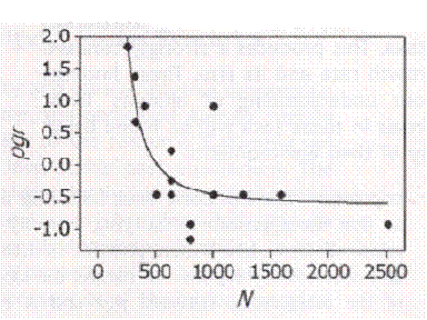
The mechanism can be seen at work simply by looking at animals in the field and comparing population size with growth rate as a surrogate for fertility. More than 1,000 such studies have been collected and this is what they found:
On the Regulation of Populations of Mammals,
Birds, Fish, and Insects, Richard M. Sibly et al.
SCIENCE vol. 309 no. 5734 July 22, 2005
page 607 – 610.
The vertical axis is the growth rate. The horizontal
axis is the estimated population size. They did not
find inbreeding depression but we know it is real.
Including the known but unobserved phenomenon of inbreeding depression, what we have is a curve skewed to the left.(Corrected March 22) This happens in humans as well.
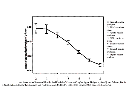
Association between Kinship and Fertility of
Human Couples Agnar Helgason et al.
SCIENCE vol. 329 no. 5864 February 8, 2008
page 813 – 816.
The vertical axis is a measure of the fertility of
the couples. The horizontal axis is their kinship
as reckoned by counting ancestors 10 generations
back. Again inbreeding depression is to be assumed
although it was not observed in the first generation.
In each case the curve is skewed left but tends to saturate out with little effect once low degrees of kinship are reached. Arguably 1,000 is too many for a stable population. Here is a study from Denmark comparing fertility with distance between birthplaces of couple.
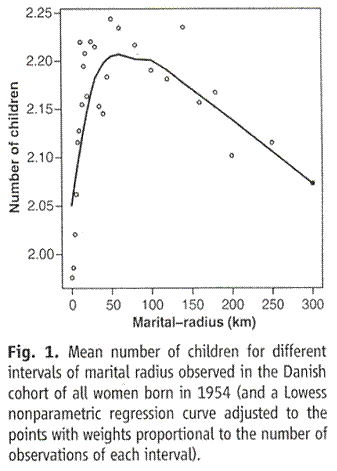
Comment on “An Association Between the Kinship and Fertility of Human Couples,” Rodrigo Labouriau and António Amorim SCIENCE vol. 322, page 1634b December 12, 2008.
For big numbers, here is a graph of everybody born in the last fifty years. This is for all the jelly beans. UN numbers:
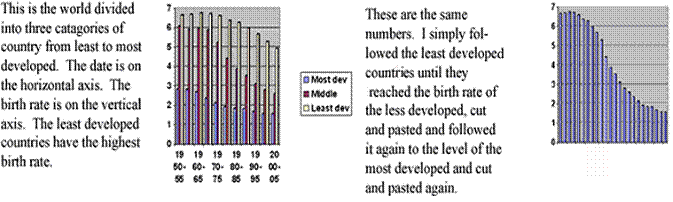
Putting together the different parts of the world we can see the birthrate falling according to a single pattern. Again the curve skews left and tends to saturate. From the appearance here we should be able to expect a soft landing. The population everywhere should decline gently and at some time in the future we can start marrying cousins again and have whatever birth rate we like. The problem is that for the past thirty years the developed world has been below replacement. Siblings are rare and first cousins are becoming rare. A few more generations like that and the kin couples that could be fertile will not exist in significant numbers.
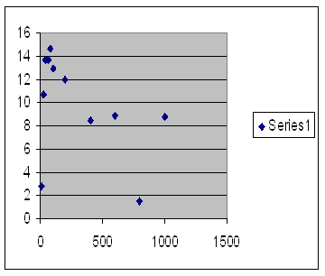
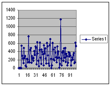
The most basic distinction in infertility is between pre-zygotic infertility in which the sperm is unable to unite with the ovum and post-zygotic infertility in which the zygote does not develop into a fully fertile adult. Both of these can be modeled by a computer program that shows infertility in a population. Here are graphs showing the fertility against population size and a single run of a population limited to 1,000 – the limit for the program. On the left the vertical axis is offspring per member of the population and the horizontal axis is maximum population size averaging 10 runs. On the right the vertical axis is total offspring that generation and the horizontal axis is the generation number.
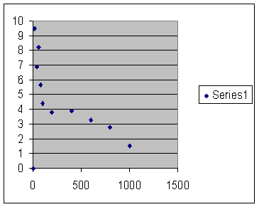
Runs last up to 1,000 generations. Initial population 100. Maximum offspring (think ovulations) per couple 100. 100 sites affecting pre-zygotic infertility. “Mutation” rate 10,000 per site per 100,000 generations. One “mutation” of mismatch loses 1,000 one thousandths of an offspring.
This happens too fast to be DNA mutations. The mechanism must be epigenetic. The curves skew to the left.
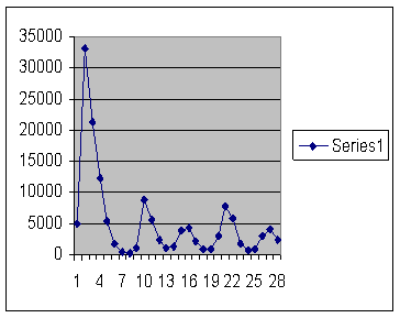
Here are two graphs showing the same thing for a post-zygotic mechanism.
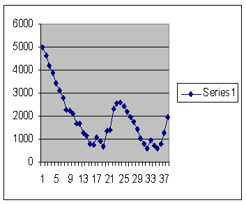
Vertical axis on the left is offspring per member of the population and horizontal axis the maximum population size. Vertical axis on the left is total offspring for that generation and horizontal axis is generation number. Runs last up to 1,000 generations. Initial population 100. Maximum offspring (think ovulations) per couple 100. 100 sites affecting post-zygotic infertility. “Mutation” rate 1,500 per site per 100,000 generations. One “mutation” of mismatch loses 1,500 one thousandths of an offspring.
The left hand graph is very noisy; the populations are very unstable at high and low numbers with several extinctions. But it is adequate to show the left skew. So this mechanism skews left like the other and like the data so we might be forgiven for thinking we are on the right track.
However things are not so simple. There is a place called Long House Valley in the
American Southwest that was farmed by Anasazi Indians for some centuries. By doing carbon fourteen analysis on the charcoal in their fireplaces it was possible to tell how many dwellings were occupied each year and thus establish an annual census. It was found that the population size correlated closely with tree ring width so that it was concluded that the population was limited by the amount of food that could be grown.
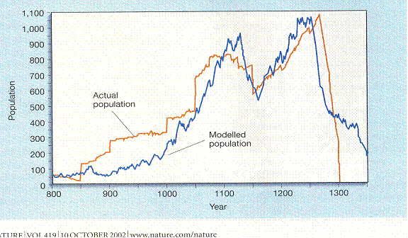
Jared M. Diamond, “Life with the Artificial Anasazi,” NATURE, vol 419 no 6907, October 10, 2002 p 567.
We may observe however that there are stepwise increases in the population which can only be immigration. Since there are, at the end, no stepwise decreases the population decline cannot be attributed to emigration, war, plague or famine. It is only fertility; they were cultivating the trees. At least in the final cycle the curve skews right.
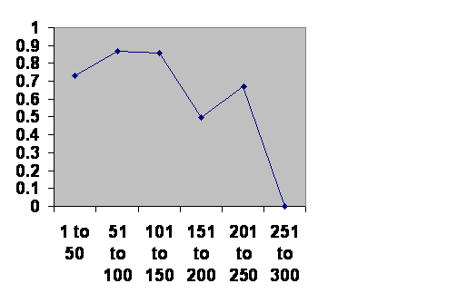
Alone this could be a fluke. But here is the survival history of Chinese dynasties. The horizontal axis is the ages of the dynasties, the vertical their chance of surviving another 50 years at any given age.
Information taken from John B. Teeple TIMELINES OF WORLD
HISTORY, DK Publishing, New York, NY, 2006 page 554-5.
Again we see two cycles. Arguably the second skews
right.

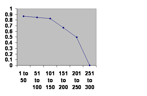
Here is Japan
 .
.
Same source. Again it appears that the second cycle
skews toward the right. The two notches occur at
the same half century point. The fact that the second
peak is lower may have to do with the fact that the
Anasazi accepted immigrants, something dynasties
are reluctant to do.
We are looking at the ages of the populations. When a society takes over a tract of land, that society may already have some age so their tenure does not necessarily reflect their age. The notch between the two cycles gets blurred out. Here is Southern Mesopotamia.
Information taken from R. H. Carling THE WORLD HISTORY CHART
International Timeline Inc. Vienna, VA 1985.

Although the notch is not evident, there is the
characteristic decline which becomes slightly but
inexorably steeper as the 300 year limit is reached.
This is the summation of Rome, the Classical Mayans and Chaco Canyon.
Information taken from BBC and The Collapse of Complex
Societies, Joseph A. Tainter, Cambridge University Press,
Cambridge, Eighteenth printing, 2009.
The pattern is essentially the same.
It is not just humans. Here is the record of a number of mouse “plagues.”
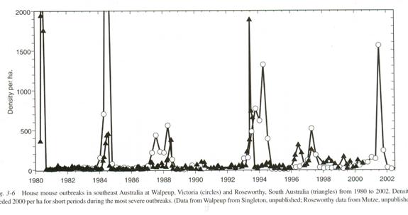
The Mouse in Biomedical Research second edition Volume 1 History, Wild Mice and Genetics, chapter 3 “The Secret World of Wild Mice” section VI Population Dynamics part C. Population Eruptions (Mouse Plagues in Australia; population eruptions in New Zealand) Grant R. Singleton and Charles J. Krebs editors James G. Fox, Muriel T Davisson, Fred W. Quimby, Stephen W. Barhold, Chritian E. Newcomer and Abigail L. Smith Elsever Burlington 2007 page 39. The caption reads: House mouse outbreaks in southeast Australia at Walpeup, Victoria (Circles) and Roseworthy, South Australia (Triangles) from 1980 to 2002. Densities exceeded 2,000 per ha (hectare) for short periods during the most severe outbreaks. Data from Walpeup from Singleton, unpublished; Roseworthy data from Mutze, unpublished.)
The biggest plagues are single cycle. More moderate ones are two cycle, the second peak skewed right. During plagues the mice lose their territoriality. The males no longer defend their females and there is degree of mixing of different families. This may be why the curve is more like that of the Anasazi than the Asian dynasties.
Since this applies to animals as well, explanations involving human capabilities, like choice and forethought, do not apply.
So there is a contradiction. Sometimes we see the curve skewing left and sometimes to the right. The difference is that the left skewing curves cover events that last perhaps one or two generations. The right skewing curves cover events that last perhaps five or ten generations.
One possibility is that there are two mechanisms, one pre-zygotic and the other post-zygotic that have different characteristic cycle lengths. We can evaluate that by running another computer simulation, a single run of a population subjected to the same pre-zygotic and same post-zygotic influences we examined above. I left out the first five generations as being uncharacteristic and included the next thirty.
The vertical axis is population size. The horizontal is generation number. The pattern has become so chaotic that questions of skew do not apply. Evidently we are not on the right track. Both mechanisms are set by population size at the same time so that they interact in a complex way. (There is a cautionary tale here. If there is a simple relationship, do not look for a complex explanation.)
What seems most likely to be going on here is that there are two mechanisms indeed. One of them is probably pre-zygotic, follows the logic of the computer model and accounts for the bulk of the infertility seen at any one time. This may be it in action. These deer mouse sperm have formed flying wedges, something they will do with kin but not with non-kin, which lets them advance faster.
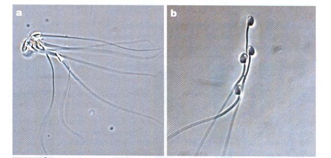 Pictures from Competition Drives Cooperation Among Closely Related Sperm of Deer Mice, Heidi S. Fisher and Hopi E. Hoekstra, NATURE vol. 463. no. 7282 February 11, 2010 page 801.
If the sperm can recognize and bind to kin sperm likely they can recognize and bind, or at least bind better, to kin ova in humans. Thus there ought to be a pre-zygotic component to human infertility caused by lack of kinship. Since the infertility accumulates over multiple generations, there must be another mechanism that affects later generations, unquestionably born out by this, another graph from the Iceland study.
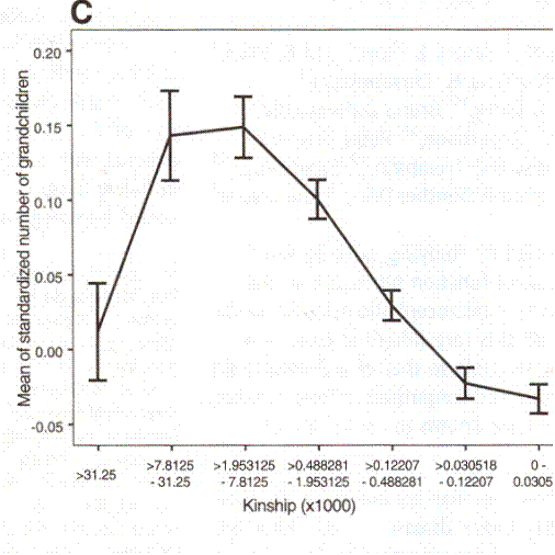
Human Couples Agnar Helgason et al. SCIENCE vol. 329 no. 5864 February 8, 2008 page 813 – 816.
A mechanism affecting later generations is by definition post-zygotic. Conceptually it is simple to make a computer program that will emulate the process, given one already has one that can model pre-zygotic infertility and post-zygotic infertility. However as a practical matter it has proven difficult. The C++ language compiler I have from Microsoft is already staggering under the complexity of what it already has. Programs get corrupted when an attempt is made to modify them even without adding to them. Files show unaccountable chromosome structure. Fortunately the present program, while flawed, does seem to deliver the needed functionality.
So the question now is whether it is possible to distinguish between an early pre-zygotic mechanism and a delayed post-zygotic mechanism in humans. For this we turn to Google’s Gapminder.com. For getting the feel of it, there is no substitute for going to the site and loading the program. I was unable to download these graphs so I photographed the screen during January and February of 2011.
What you do once the program loads is to assign total fertility to the horizontal axis. It is the first thing on their menu of choices. They know it’s important. Assign age of first marriage of women to the vertical axis, it is the last thing under the “population” button on the menu. Then you can chose a year, play through the available years or have the program track selected countries over a period of years.
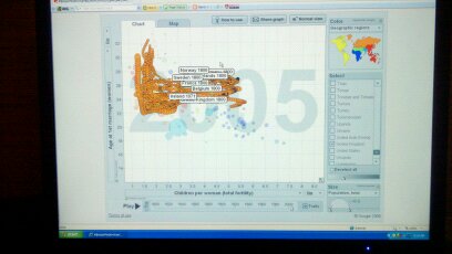
Here are all the countries in the world as of the year 2000.
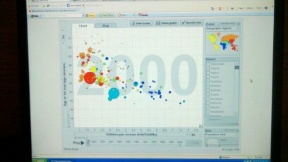
Here they are five years later.
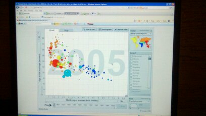
You can see that even over this brief interval fertility is falling and age at marriage is rising.
Here is the track of a few selected countries over that time.
As you can see, fertility falls and then age at first marriage rises. It is really quite elegant. No sooner does the pre-zygotic mechanism saturate out and the birth rate stabilize than the age of marriage begins to rise. Here, for example, is Sweden tracked from 1945 to 2005.
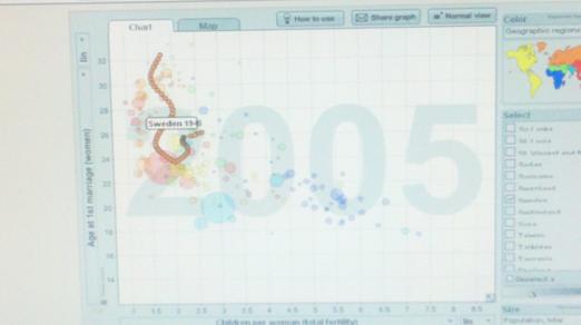
You are looking at the fertility rate falling. That must be the pre-zygotic mechanism at work. Then it saturates with a birth rate below replacement but no longer falling. In fact it shows some tendency to rise but not for long. But as the birth rate falls below replacement, something begins to slow down the women’s biological clocks. It would be a post-zygotic mechanism. At this rate by the times girls now 15 reach 40 the marriage age will be 40. Those under 15 will not want to have children at all and those over are either married or in love.
Much of the rest of the world is not so far along, but there is no country that is unaffected.
It is too early to propose a cure. There simply has not been enough talent brought to bear. And it may well be too late to accomplish anything.
But it is neither too early nor too late to denounce the prejudice that is destroying us, the prejudice against marrying cousins.
This poster will be presented on Nobabies.net on March 18, 2011
NORMAL GENETIC VARIATION PRODUCES PREZYGOTIC INFERTILTY
There have been 12,464 visitors so far.
Home page